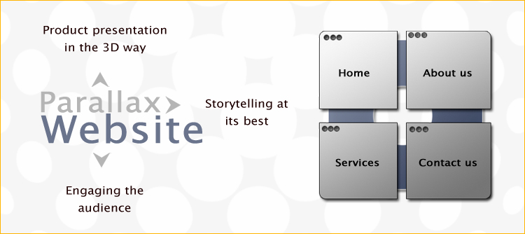
If you are born in the 1990s, you may have seen the text-based websites, which were mostly table-based and incorporated flash designing, PHP, Javascript and CSS. Many of them are still in vogue, but newer dimensions have been added in the form of parallax scrolling, a design technique which helps to create an illusion of depth of fields for the user. Sounds interesting? Let us find out how parallax websites have created a phenomenal change in the way users engage and involve with a website.
Product Presentation in the 3D Way
Parallax websites is probably the most dynamic way of presenting your products. Unlike flash or video which shows the products in a static version, parallax websites allow the user to explore the product in the most interactive way. This is an obvious advantage, which brands like iBrandox will tell you. Now customers will not only view the product, but explore its characteristics in their own way. The scrolling technique which is the USP of such websites helps to manipulate the behaviour of the image, present its characteristics in the 3D way, and helps to define the product. The product takes the center stage with its mannerisms and enthralls the users. It is probably the extensive use of the white space which also draws all the attention to the product itself.
Storytelling at its Best
You will agree with professionals like iBrandox when they tell you that parallax design enhances the narrative aspect of the product. The design actually helps the story to unfold in a vivid and subtle way. In fact, the storytelling aspect is so engaging and interactive, that it allows the users or the customers to take control and walk through the narrative in their pace. As you scroll the website, the different layers behave differently, creating a sense of multiple stories being played out in different planes. The multiple stories merge into one, as the characteristics of the product unfolds making it one big synchronized story. It is probably the power of the pictorial which helps the users to be engrossed and engaged.
Different brands have used the power of the narrative in different manners. Some have used it like a time machine to demonstrate the history of the product. Others have used the power of illustrations to narrate the story. In fact, there are stories which are accompanied by sounds making it all the more alive. As a user or a visitor, you are gradually drawn inside the story as it starts interacting with you on different levels. The engaging quality is such that you feel that you are inside the story as a witness and not some random visitor who is looking into a product.
Engaging the Audience
The main aim of parallax design is to engage the audience, so that they feel that when they are scrolling, they are in charge. They should take an active role, while initiating their interaction with the site. iBrandox, for instance, will put emphasis on this fact as they know that without the involvement of the audience, the purpose of the product is lost. You will be surprised to know that when audience starts interacting with the site and the products, they become more open to the message. You have to be creative with your designs. Let your visitors think about the product. If you cannot pique their curiosity, why will they choose your product?
In fact, the design should be engaging to that level, that the users are bound to go to each and every section to find out what is in store for them. Every section holds a secret promise of something new and as the audience becomes engaged, they are more willing to check each section. An impressive story will definitely lead the audience to think about the product. In most cases, it is seen that they have come back to buy the product. Parallax design has been a tremendous boost for online business. Each and every parallax website is different and unique which makes them all the more interesting.
Parallax design is probably the next big thing in online business. But it depends on you, how you want to incorporate the design and how you want to represent your product!